コンポーネント
インセット
コンテンツが周囲のコンテナに食み出すように、負のマージンを適用します。
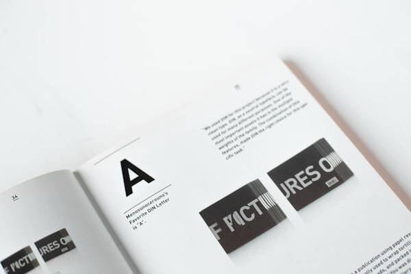
タイポグラフィとは、文字を配置して、表示されたときに、書かれた言語が読みやすく、判読しやすく、魅力的になるようにする芸術と技術です。
<Box maxWidth="240px">
  <Card size="2">
    <Inset clip="padding-box" side="top" pb="current">
      <img
        src="https://images.unsplash.com/photo-1617050318658-a9a3175e34cb?ixlib=rb-4.0.3&ixid=M3wxMjA3fDB8MHxwaG90by1wYWdlfHx8fGVufDB8fHx8fA%3D%3D&auto=format&fit=crop&w=600&q=80"
        alt="Bold typography"
        style={{
          display: 'block',
          objectFit: 'cover',
          width: '100%',
          height: 140,
          backgroundColor: 'var(--gray-5)',
        }}
      />
    </Inset>
    <Text as="p" size="3">
      <Strong>Typography</Strong> is the art and technique of arranging type to
      make written language legible, readable and appealing when displayed.
    </Text>
  </Card>
</Box>
APIリファレンス
このコンポーネントは、div 要素に基づいており、共通のマージンプロパティをサポートします。
| Prop | 型 | デフォルト |
|---|---|---|
asChild | boolean | デフォルト値なし |
side | Responsive<enum> | "all" |
clip | Responsive<"border-box" | "padding-box"> | "border-box" |
p | Responsive<"current" | "0"> | デフォルト値なし |
px | Responsive<"current" | "0"> | デフォルト値なし |
py | Responsive<"current" | "0"> | デフォルト値なし |
pt | Responsive<"current" | "0"> | デフォルト値なし |
pr | Responsive<"current" | "0"> | デフォルト値なし |
pb | Responsive<"current" | "0"> | デフォルト値なし |
pl | Responsive<"current" | "0"> | デフォルト値なし |